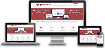
Responsive web design (RWD) is an approach to web design aimed at crafting sites to provide an optimal viewing and interaction experience—easy reading and navigation with a minimum of resizing, panning, and scrolling—across a wide range of devices (from desktop computer monitors to mobile phones).
A site designed with RWD adapts the layout to the viewing environment by using fluid, proportion-based grids, flexible images, and CSS3 media queries, an extension of the @media rule, in the following ways:
- The fluid grid concept calls for page element sizing to be in relative units like percentages, rather than absolute units like pixels or points.
- Flexible images are also sized in relative units, so as to prevent them from displaying outside their containing element.
- Media queries allow the page to use different CSS style rules based on characteristics of the device the site is being displayed on, most commonly the width of the browser.
Some of the RWD and mobile design challenges have created a catalog of multi-device layout patterns. It is suggested that, compared with a simple RWD approach, device experience or RESS (responsive web design with server-side components) approaches can provide a user experience that is better optimized for mobile devices. Server-side "dynamic CSS" implementation of stylesheet languages like Sass or Incentivated's MML can be part of such an approach by accessing a server based API which handles the device (typically mobile handset) differences in conjunction with a device capabilities database in order to improve usability. RESS is more expensive to develop, requiring more than just client-side logic, and so tends to be reserved for organizations with larger budgets. Google recommends responsive design for smartphone websites over other approaches.
Although many publishers are starting to implement responsive designs, one ongoing challenge for RWD is that some banner advertisements and videos are not fluid. However, search advertising and (banner) display advertising support specific device platform targeting and different advertisement size formats for desktop, smartphone, and basic mobile devices. Different landing page URLs can be used for different platforms, or Ajax can be used to display different advertisement variants on a page. CSS tables permit hybrid fixed+fluid layouts.
There are now many ways of validating and testing RWD designs, ranging from mobile site validators and mobile emulators to simultaneous testing tools like Adobe Edge Inspect. The Firefox browser and the Chrome console offer responsive design viewport resizing tools, as do third parties.
Responsive websites simplify internet marketing and SEO. Instead of having to develop and manage content for multiple websites, businesses with responsive sites can take a unified approach to content management because they have only the one responsive site to manage. As the internet transforms further into a platform of services and user interfaces that tie those services together, leveraging this technology in the future will allow companies to integrate a plethora of back-end services, such as Facebook, Twitter, Salesforce.com, and Amazon Web Services, and then present the integrated data back out the front-end iad (Apple's advertising platform) layer on a responsive design so the application looks great on all devices without custom coding needed for each device or screen size.
Contact us for information as to how we can help you design a new responsive site or to help convert your current website.